
Everything communicates your brand and packaging has more purpose than just wrapping your product. Here an example from the world of Whisk(e)y.
The explicit labelling with resulting perceptions may have implications. This has been discussed using comparable products and research methods (Bruwer and Buller, 2012). As a communications tool, labelling has been identified as signifier of quality (Kilani et al., 2020). Impacts of visual design elements, such as colour and shape and the impact of packaging on perceptions of taste and quality are discussed in depth (Chitturi et al., 2021; Adams et al., 2014). Extensive research is available, even dealing with the impact of labelling highlighting the year of the establishment of (Japanese) businesses (Maezawa and Kawahara, 2021). Age of Whisk(e)y is an important label in establishing quality. Further empirical research reviewed also highlights the difficulties to convey product qualities using language (Croijmans et al., 2020), which would need to be considered. Tactile characteristics can be incorporated into the product design, which other brands have adopted too. While research suggests that product adaptation may be required, findings are to demonstrate that limited adaptation is needed in cases where even packaging has its own name, such as "The Tround" used for Glenfiddich, a signifier for the characteristics of the product (Russel, undated).
Beyond tangible product features, the perceived, augmented value of a product will be considered by consumers (Dibb et al., 2019). Perception needs to be studied in connection with country of origin effects. The direction of the perception is important: origin of the product and buyer impact perceptions and may differ if the origins are reversed (Kamins and Nagashima, 1995). Purchasing decisions are influenced by perceptions (YI CHEN et al., 2014) to the extent that additional perceived features may impact willingness to pay (Ruso et al., 2021).
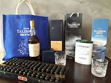
Here I am with a bottle of recently acquired "The Deacon", whereby the purchasing decision was made purely based on the bottle design, mainly its tactile characteristics. The goggles thrown in as a merchandising gift were an added bonus as I can use them to style my photos.
Brand Communication Thoughts Research Countryoforigin Whisky Product Excitement Photo Styling Tround Packaging Branding Marketing PurchaseDecision DrinkResponsibly Tactile


No comments:
Post a Comment